Stakeholder Interviews
I conducted interviews with both the founder (representing the applicant's frustrating, opaque wait times) and the attorney co-founder (representing the practitioner's manual, fragmented document workflow). These discussions revealed that the primary bottleneck wasn't the complexity of immigration law itself, but the lack of a structured system to organize, research, and assemble cases efficiently.
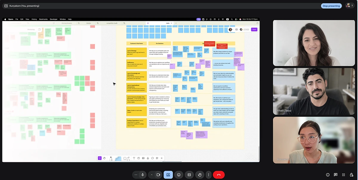
The Competitive Gap
Existing case management tools like Docketwise, LawGreex, and Clio are built for general legal practice. The lawyer co-founder identified the core gap: none of them are designed around the specific document-heavy, research-intensive workflow of immigration law. The result is that most lawyers default to a patchwork of spreadsheets, email threads, and shared drives. None of these were built for this job.
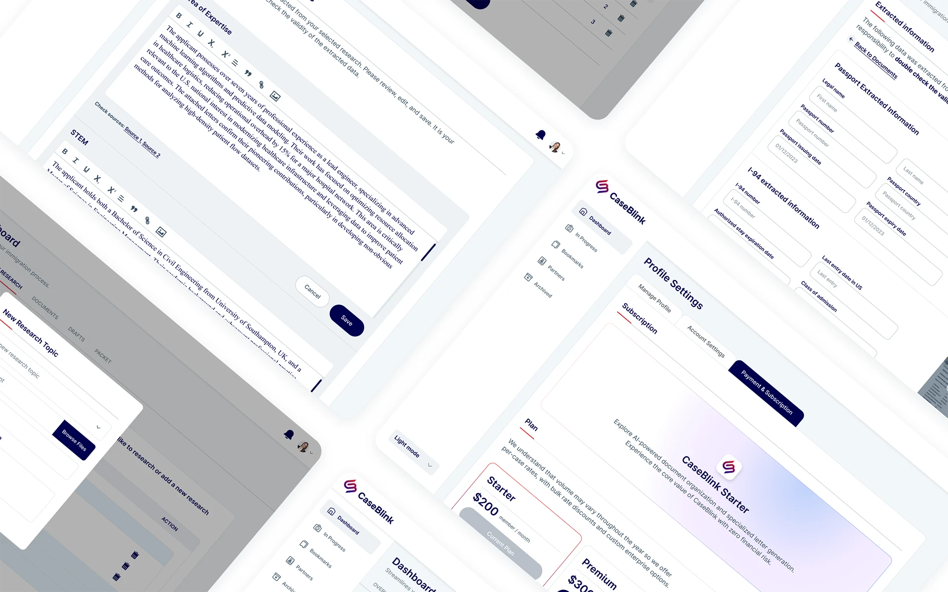
- No structured way to organise and review candidate qualifications across multiple cases.
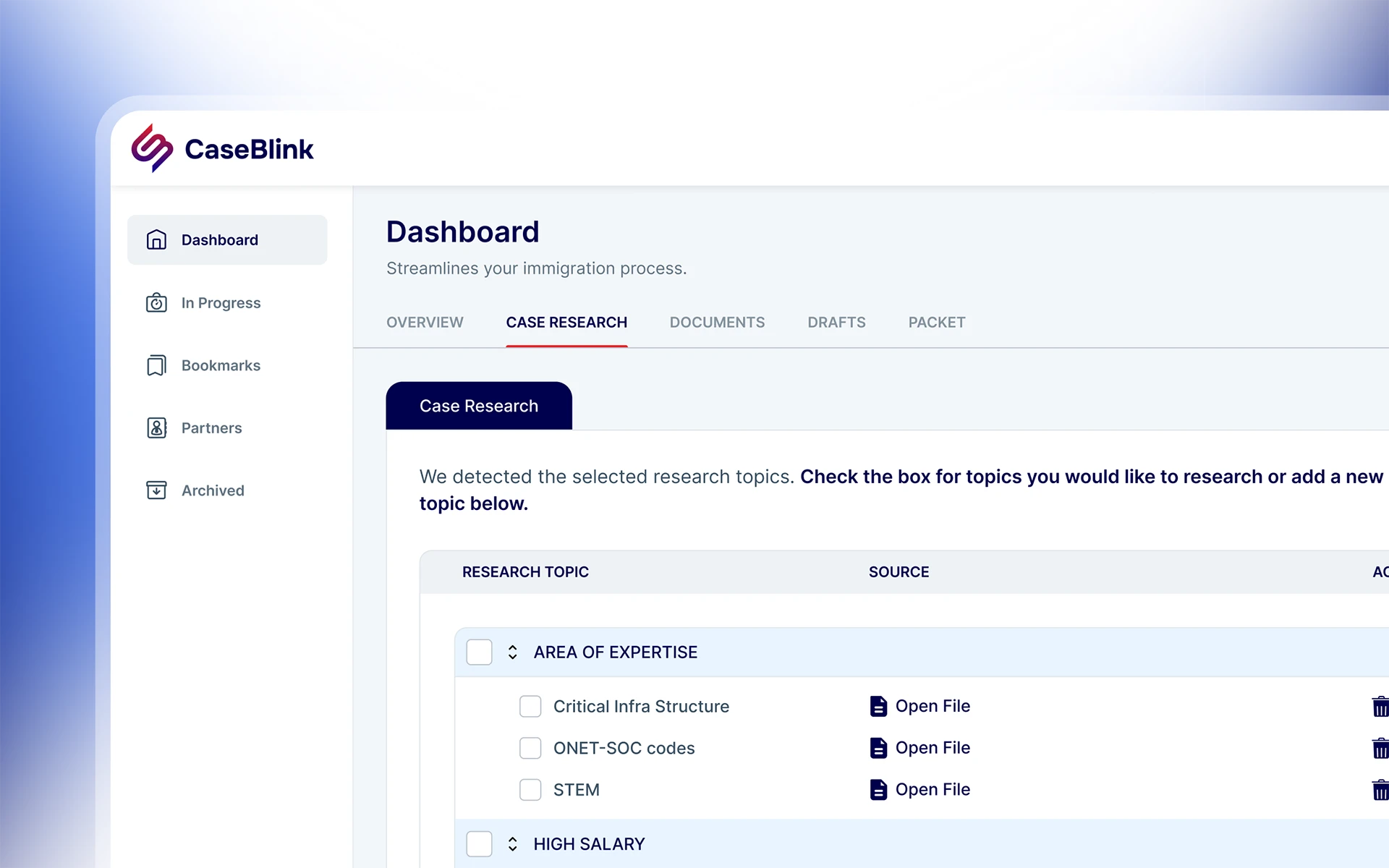
- No AI-assisted research or document extraction, and everything is manual.
- No single place to track case status across a full client list.
- Existing tools require too much setup and adaptation for immigration-specific workflows.