OVERVIEW
Redesigning the Core Application Flow
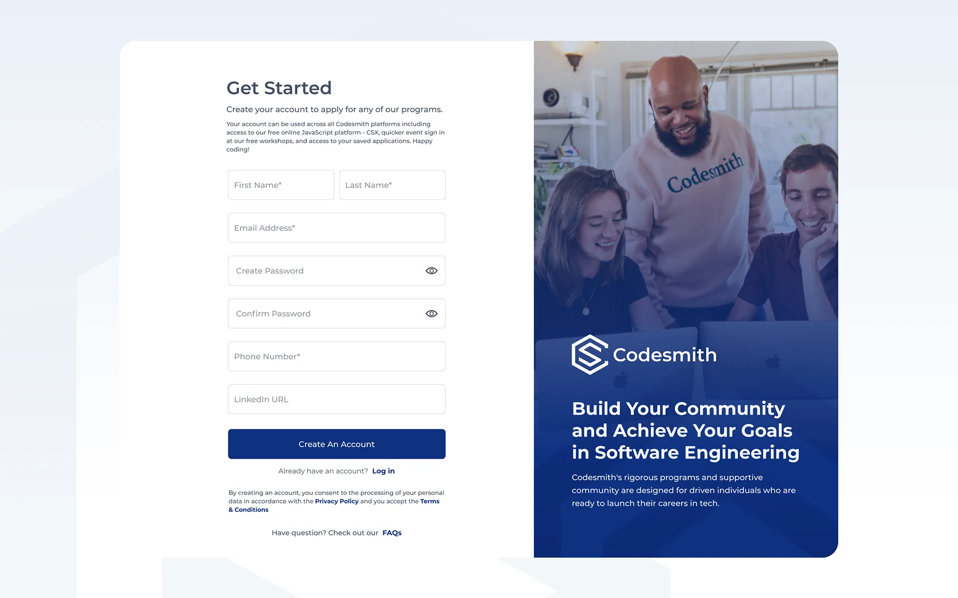
One of the central projects within my engagement with Codesmith was a full redesign of their applicant-facing application form used by every person applying to any program.
Codesmith is an immersive software engineering bootcamp with programs in Los Angeles, New York City, and remote. I worked with them as a remote contractor for nearly two years across brand identity, marketing design, and product UI.
One of the central projects within my engagement with Codesmith was a full redesign of their applicant-facing application form used by every person applying to any program.
The existing application form suffered from problems typical of a product that grew without a design system. Padding was inconsistent, and UI components were often reused loosely or reinvented entirely from one screen to the next. There was no defined visual language for states: active, error, or complete. Someone mid-application had no reliable sense of where they were, what they had completed, or what was still ahead.
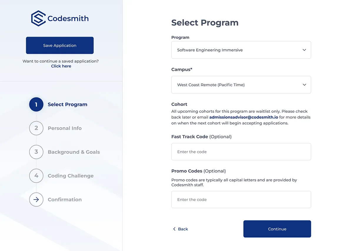
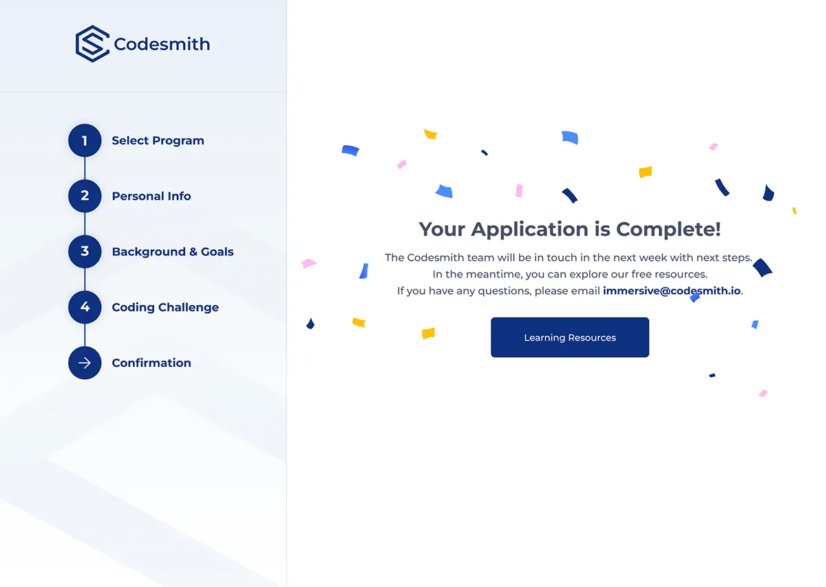
The form spans five steps: program selection, personal information, background and goals, a coding challenge (optional or required depending on the application track), and a final confirmation. With that many screens, inconsistency compounded. Minor visual noise at step one became genuine friction by step four. The brief was clear: redesign the application end-to-end, establish a proper component system, apply consistent spacing and hierarchy, and give applicants a reliable read on their progress at every stage of the flow.
Two distinct users interact with this form. The applicant is the primary one: typically a career changer or recent graduate, often applying while managing other commitments, and motivated enough to have already cleared a pre-screening step before reaching sign-up. The admissions team is the secondary user. They need clean, complete submissions and enough signal to make decisions efficiently.
Because Codesmith runs applicants through pre-screening before they reach the application, anyone who makes it to the form has already demonstrated intent. Drop-off was not the core concern. Confusion was, specifically the experience of not knowing where you are in a process that has real stakes.
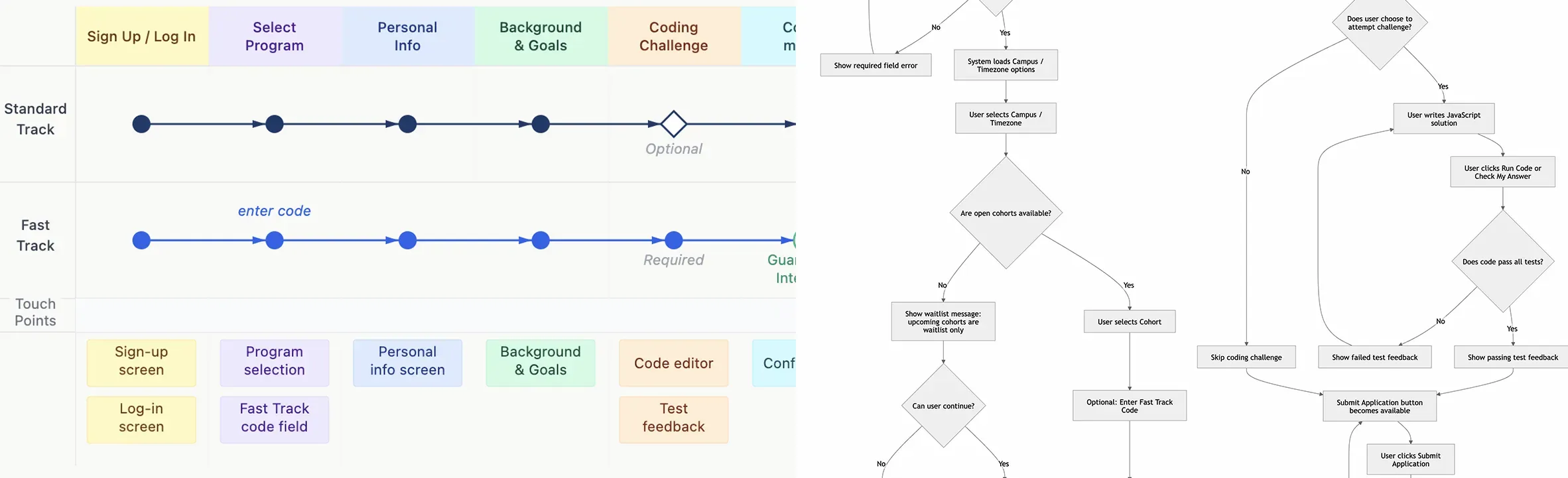
Before any visual design began, I mapped the full application structure across both tracks. The standard track moves through all five steps with an optional coding challenge. The Fast Track path, available to workshop attendees with a code, surfaces a required coding challenge and guarantees an initial interview on completion. Both paths share the same underlying navigation structure; the conditional logic is handled through the step indicator state and the challenge screen itself. The IA decisions informed the tab structure, the sidebar step indicator, and the screen hierarchy, all structural choices made before any colour or brand was applied.
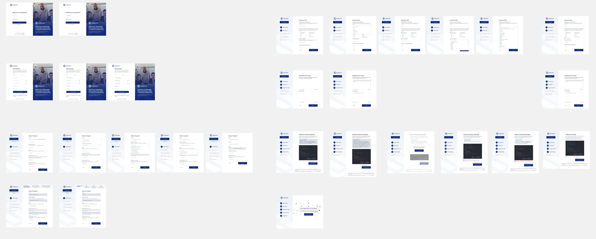
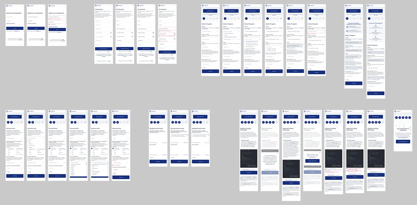
Screens showing distinct UI patterns across the application: sign-up and login with split-panel layout, program selection, personal information with inline dropdowns, background and goals with character-counted essay fields, the coding challenge environment with real-time test feedback, and the confirmation state.
.webp)
.webp)
Three decisions defined the structural character of the redesign. Each was a deliberate choice over an alternative that would have worked differently.
A progress bar tells you how far along you are, but not what is ahead. The five-step sidebar names each section and marks your current position within it, so applicants always know what they have done, what they are on, and what is left. This also made conditional states (optional vs required coding challenge depending on application track) easier to communicate without disrupting the flow.
The previous form surfaced errors at submission. For a multi-step form with a live coding challenge, that creates unnecessary friction and breaks trust. Every input in the redesign has per-field inline feedback with a consistent pattern: icon, plain-language message, field-level placement. Issues are caught and resolved in context, not at the end.
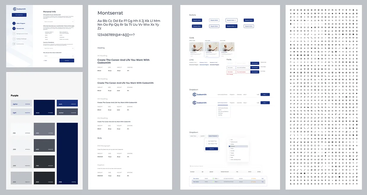
I built the component library before producing a single hi-fi screen. Default, active, and error states were defined upfront for every input type, button, and feedback element. The payoff was consistency across a flow that spans login, five distinct form sections, an optional coding environment, and a confirmation state, without resolving the same problems five times over.
A component library was built in Figma before any hi-fi screens were produced. Every input type across the form — text fields, dropdowns, checkboxes, multi-select, and the code editor — was componentised with default, active, and error states defined. Button hierarchy, spacing tokens, and inline feedback patterns were standardised across the library. Producing the individual screens then became a matter of composing from the system rather than solving the same visual problems five times over.
Internal feedback noted a reduction in the admissions team needing to follow up on incomplete or unclear submissions. Because this application redesign was part of a larger, ongoing contractor relationship covering brand, marketing, and product design, the system built here — components, states, spacing, and feedback patterns — also became the structural foundation for subsequent product work across Codesmith.