Hunchy Hills is a family-owned craft gin distillery in Queensland. They came to me needing to replace an un-trademarkable stock logo with a custom, protectable brand.
The original brand relied on a stock logo that couldn't be trademarked and failed to reflect its true identity: a female-led, small-batch distillery making award-winning craft gin.
The redesign had to elevate this positioning while solving a complex packaging constraint. Because the range includes both clear and coloured gins, I had to design two distinct label systems—wrap-around and see-through—that felt like one cohesive brand. The ultimate challenge was balancing the founder's requirement for vibrant, expressive local artwork with a sophisticated, craft aesthetic.
I reviewed the Australian premium gin shelf to understand where Hunchy Hills needed to position. The brief was to sit between feminine florals and masculine industrial, appealing across genders without being neutral. At the premium end, labels communicate quality through finish—foil, embossing, and considered typography—which set the execution standard.
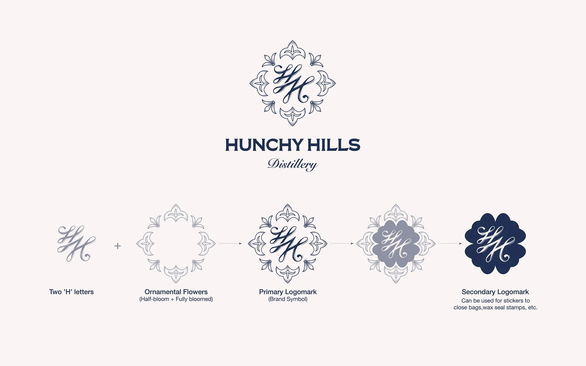
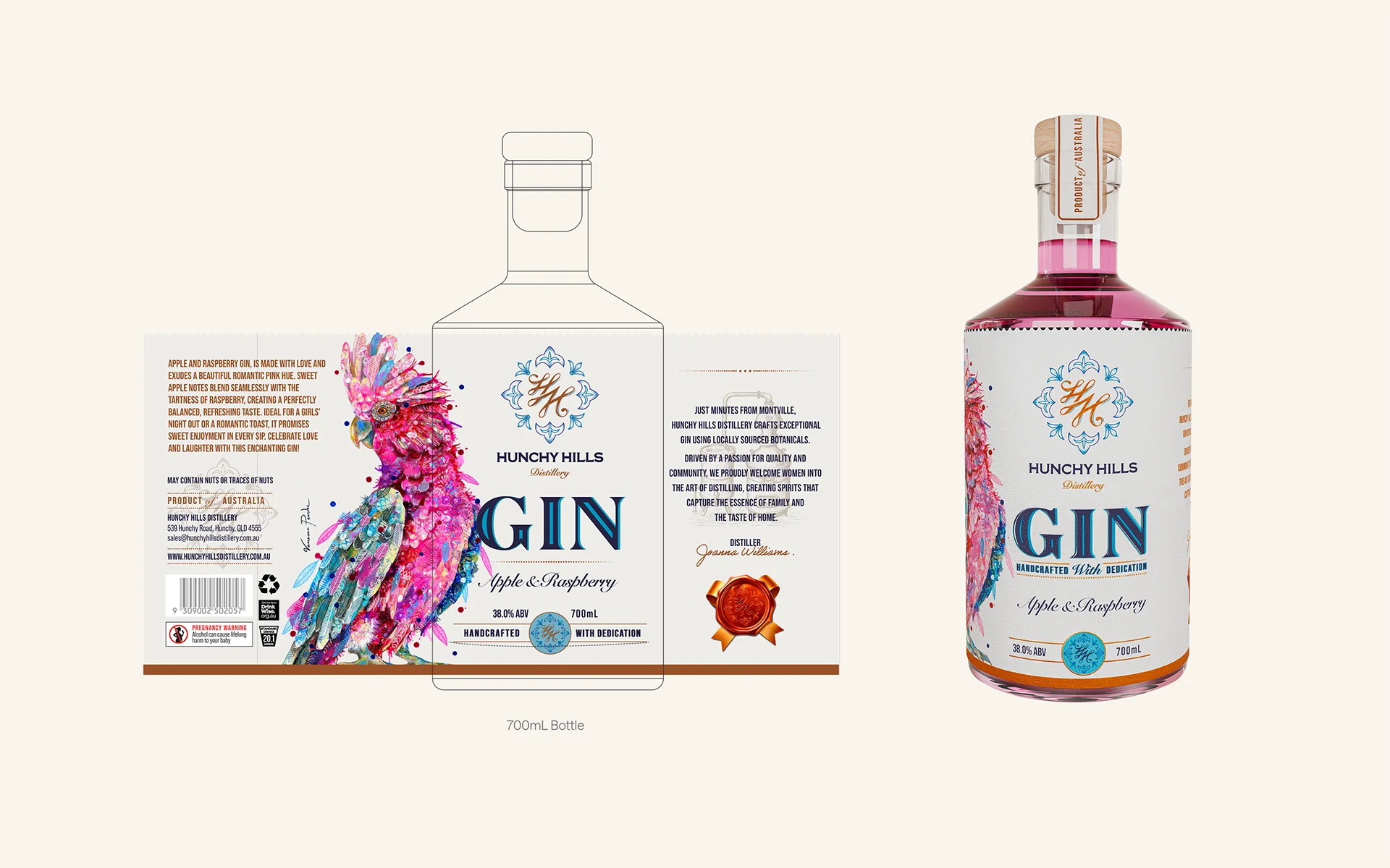
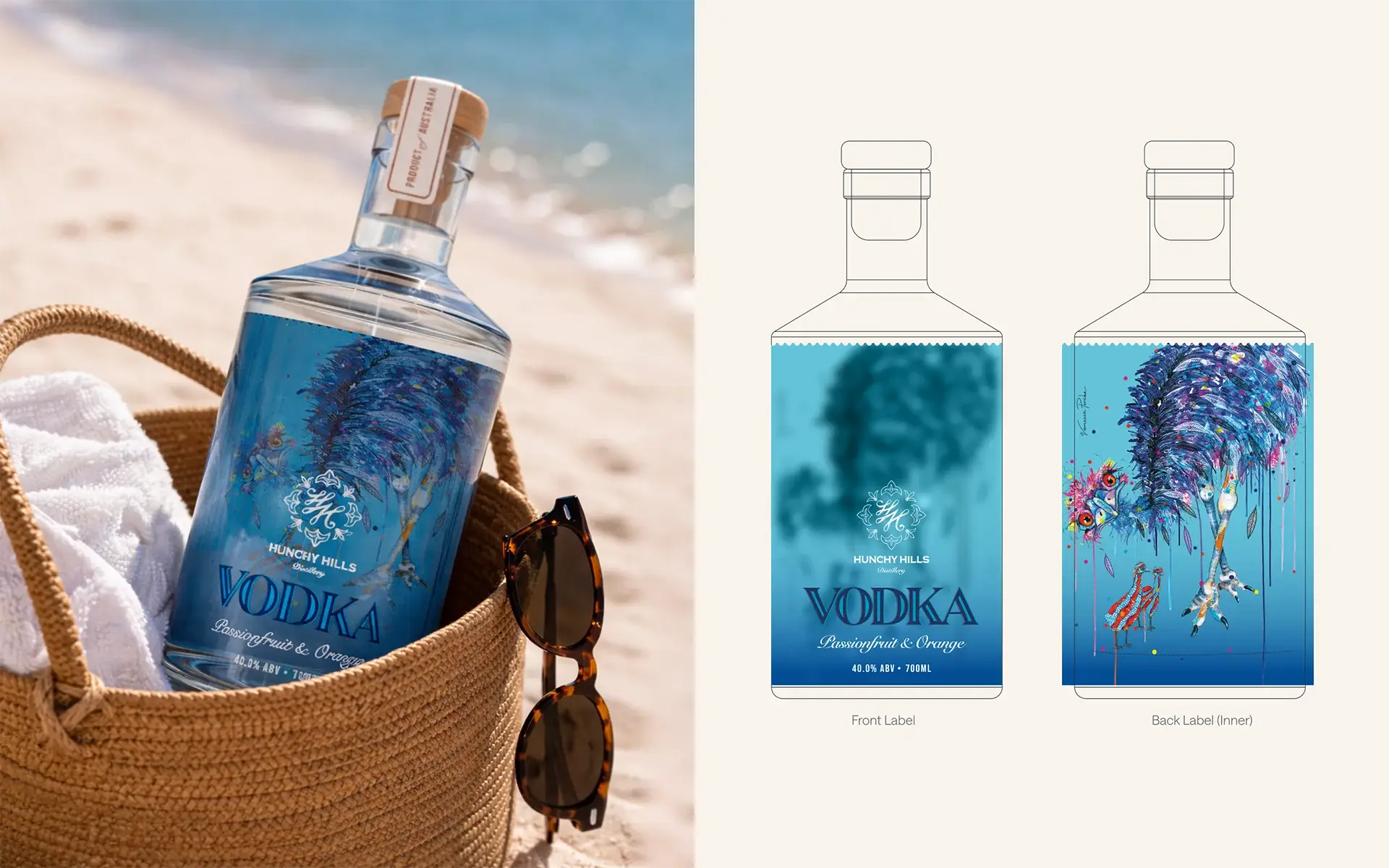
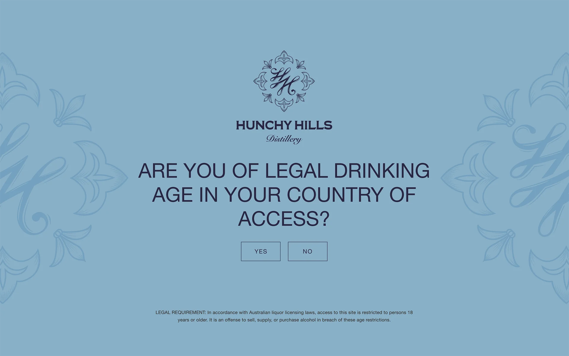
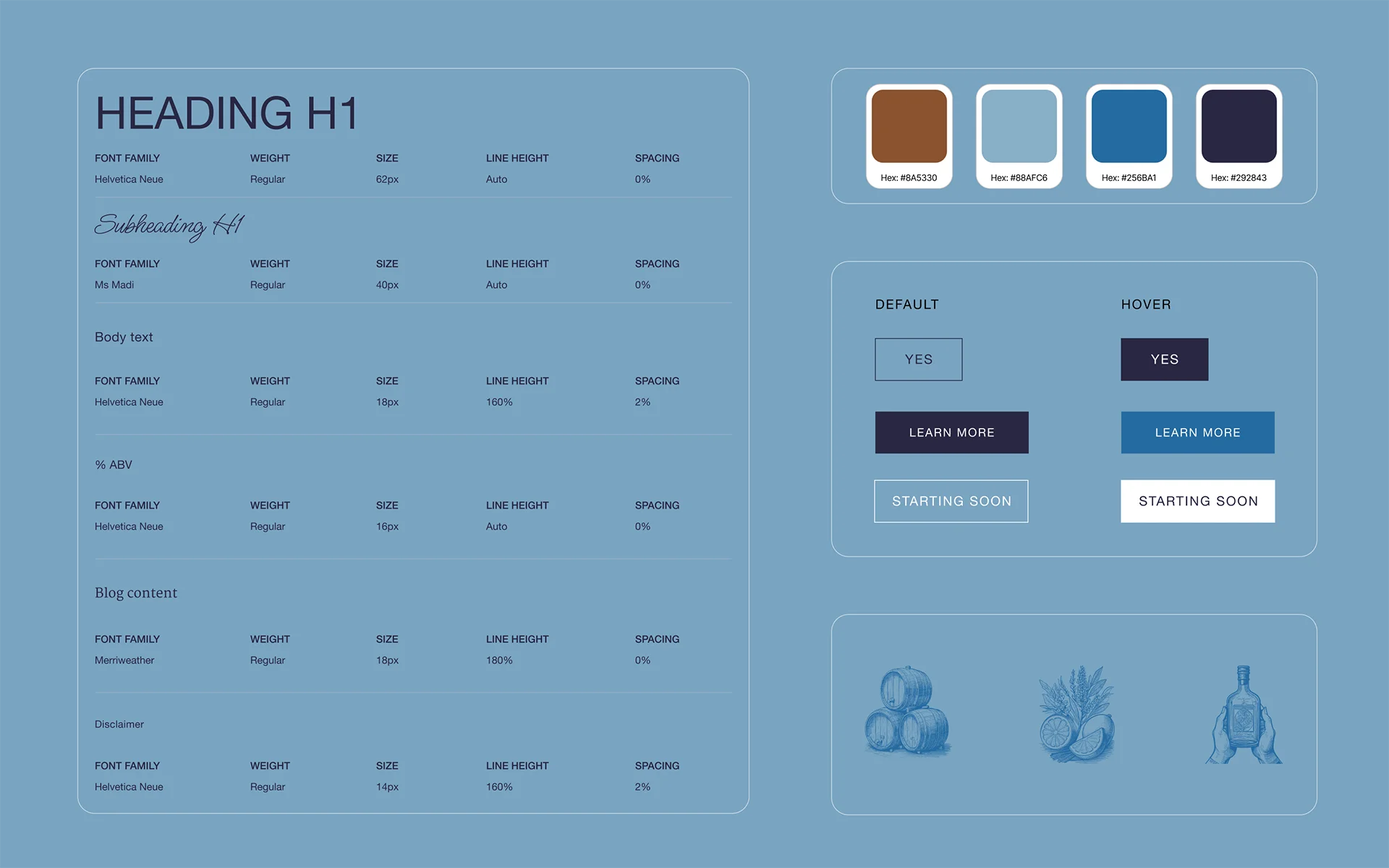
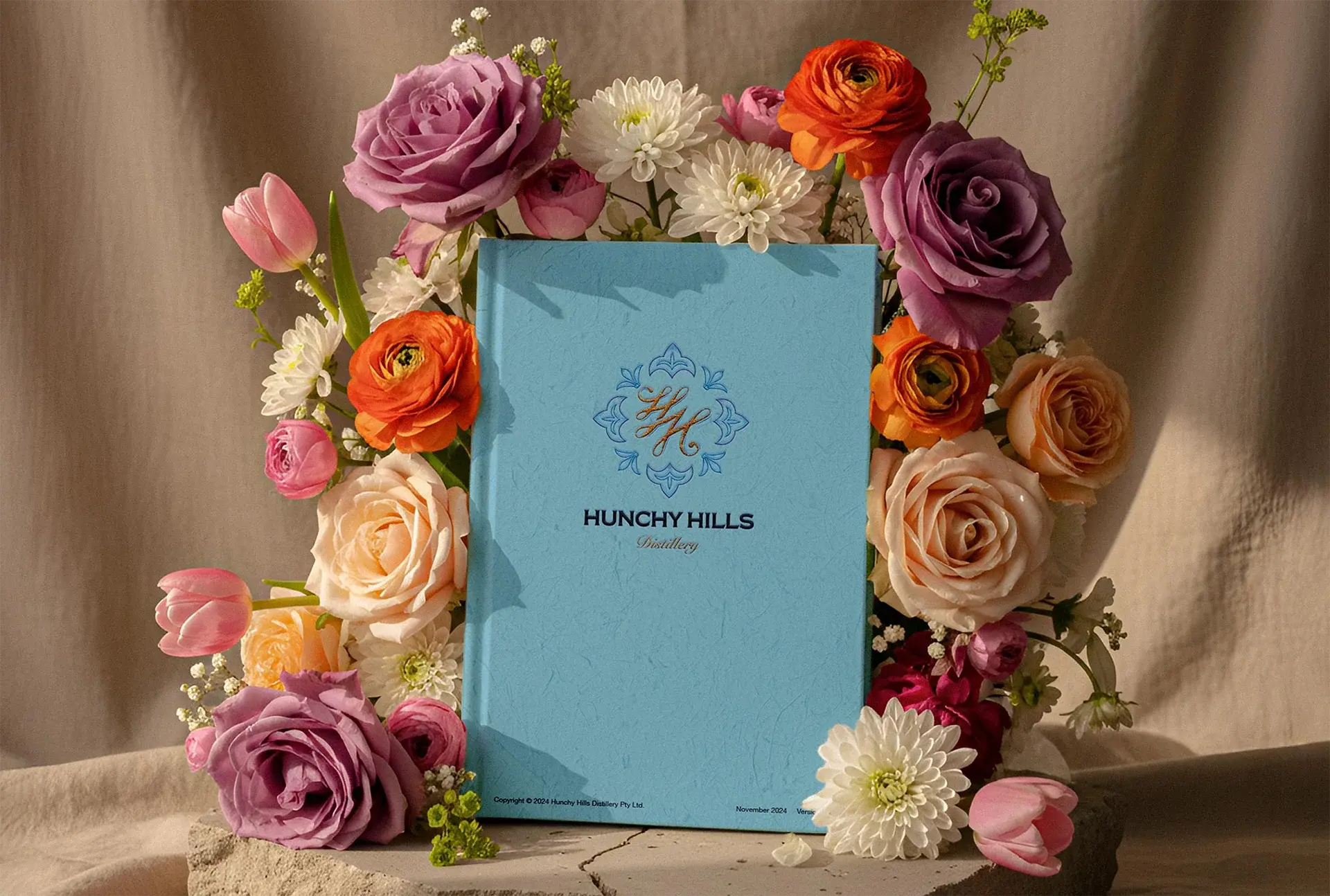
The logomark is an intertwined H monogram with floral motif detailing. The palette sits across Columbia Blue, Night Blue, and Copper Brown, with gold as the accent that runs through both the identity and the packaging finish. The intent was a brand that reads as feminine enough to be approachable and masculine enough not to exclude: sophisticated rather than pretty, considered rather than decorated.
The monogram structure was the decision that resolved the tension with the illustrations. A strong, structured logomark creates a container for expressive artwork. Without it, the vibrant illustrations would carry the visual register of the whole brand. With it, the brand has a clear identity that the artwork sits within rather than defines.
Worked with Sunshine Coast illustrator Vanessa Perske on the artwork direction. Her natural style is vibrant and painterly; the brief required that energy channelled into something premium on a spirit label.
The wrap-around label, used on the coloured gins, carries Vanessa's artwork across the full bottle surface. The label stock, gold foil stamp, and print finish were specified to communicate the quality of the product before the bottle is picked up.
The see-through label, used on the clear gins, is designed to sit against the glass so the artwork is visible through the liquid. The illustration becomes part of the bottle itself rather than something applied to the outside. This required close coordination between the label design and the illustration brief: the artwork needed to work inverted, partially obscured by liquid, and at reduced contrast.


3D renders of the finished bottles were produced in Blender to use across the Shopify store and marketing materials before the physical product was in hand. The Shopify store was designed in Figma with a full design system and design tokens before handoff to development.
A scalable brand system deployed across packaging, 3D renders, and a custom Shopify store, with design tokens carried directly into development.
The Gold award for Jolly Bold & Barrel and Best QLD Matured at the 2025 Australian Gin Awards is the distillery's achievement. The brand's job was to make sure the product could compete on shelf and at award entry level. A brand that could not be registered as a trademark could not have done that.