Case Study

Redesigning Trust for a Private Rehab Programme

Siam Rehab is a residential addiction recovery programme based in Thailand.

Client
Siam Rehab (Thailand)
Role
UX/UI & Website Designer
Timeline
2 months design, 3 months dev
Tools
Figma, FigJam, Miro
Category
Conversion Outcome
OVERVIEW

The Legacy Challenge

When they came to me, their website had been built and maintained by the founders themselves using Elementor. It had grown without structure, broke frequently, and had been extended through page duplication rather than proper templates. The result was a site that gave prospective clients and their families no clear sense of what the programme offered, what it cost, or how to apply. For a facility where programmes run from €8,500 to €24,500, that first impression has real consequences.

THE PROBLEM

Structural Problems & Amateur Visuals

The structural problems were obvious: pages had been duplicated rather than built from templates, destroying consistency. Multiple programmes lacked clear hierarchy, leaving visitors confused about options, durations, and costs. Furthermore, the admission form was a single, overwhelming page lacking screening logic. Compounding this, outdated, poorly captured photography made a professional facility look amateurish. The brief covered the full scope: audit the site, redesign the architecture and admission flow, establish a new design system, and shoot fresh on-site photography.

RESEARCH

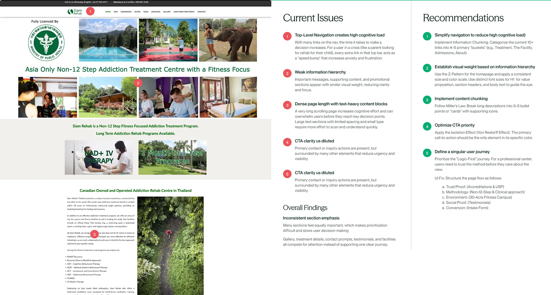
Audit & Understanding the User

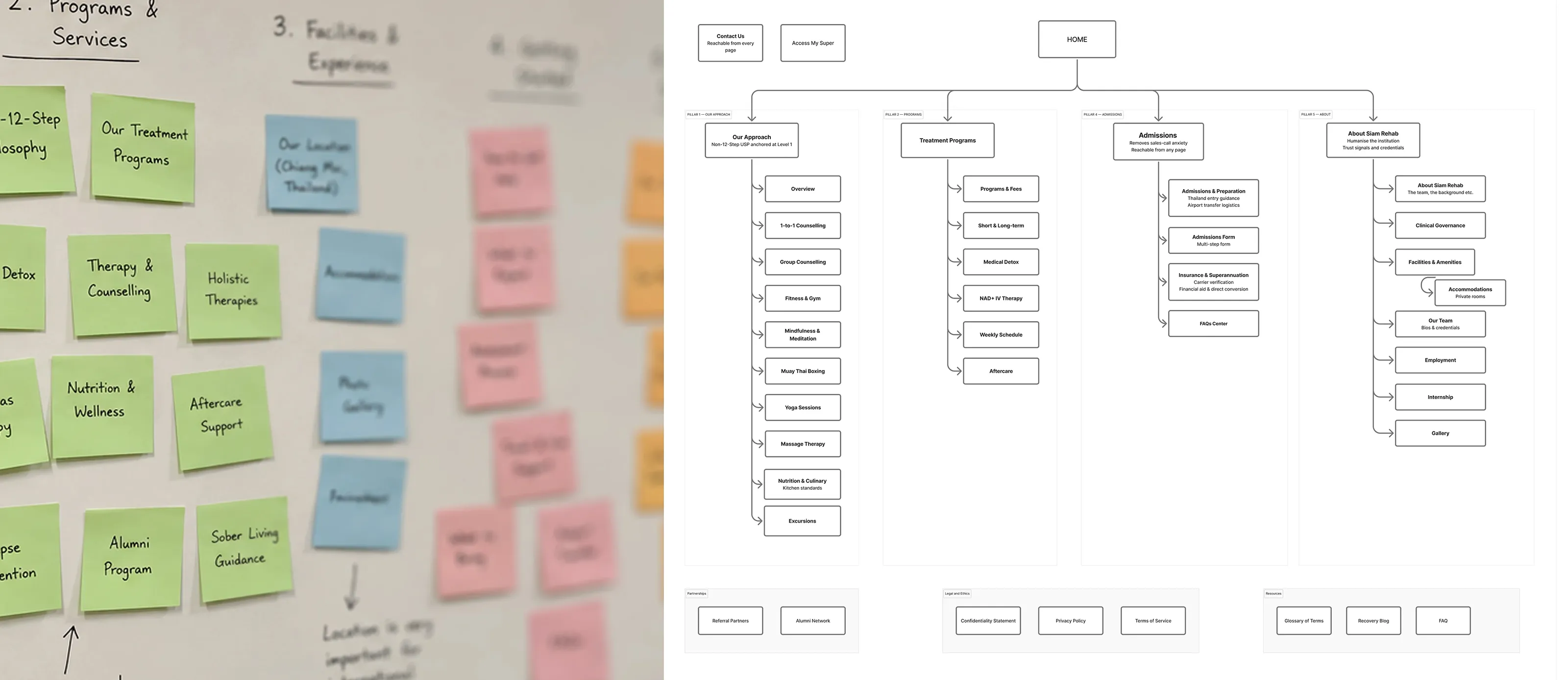
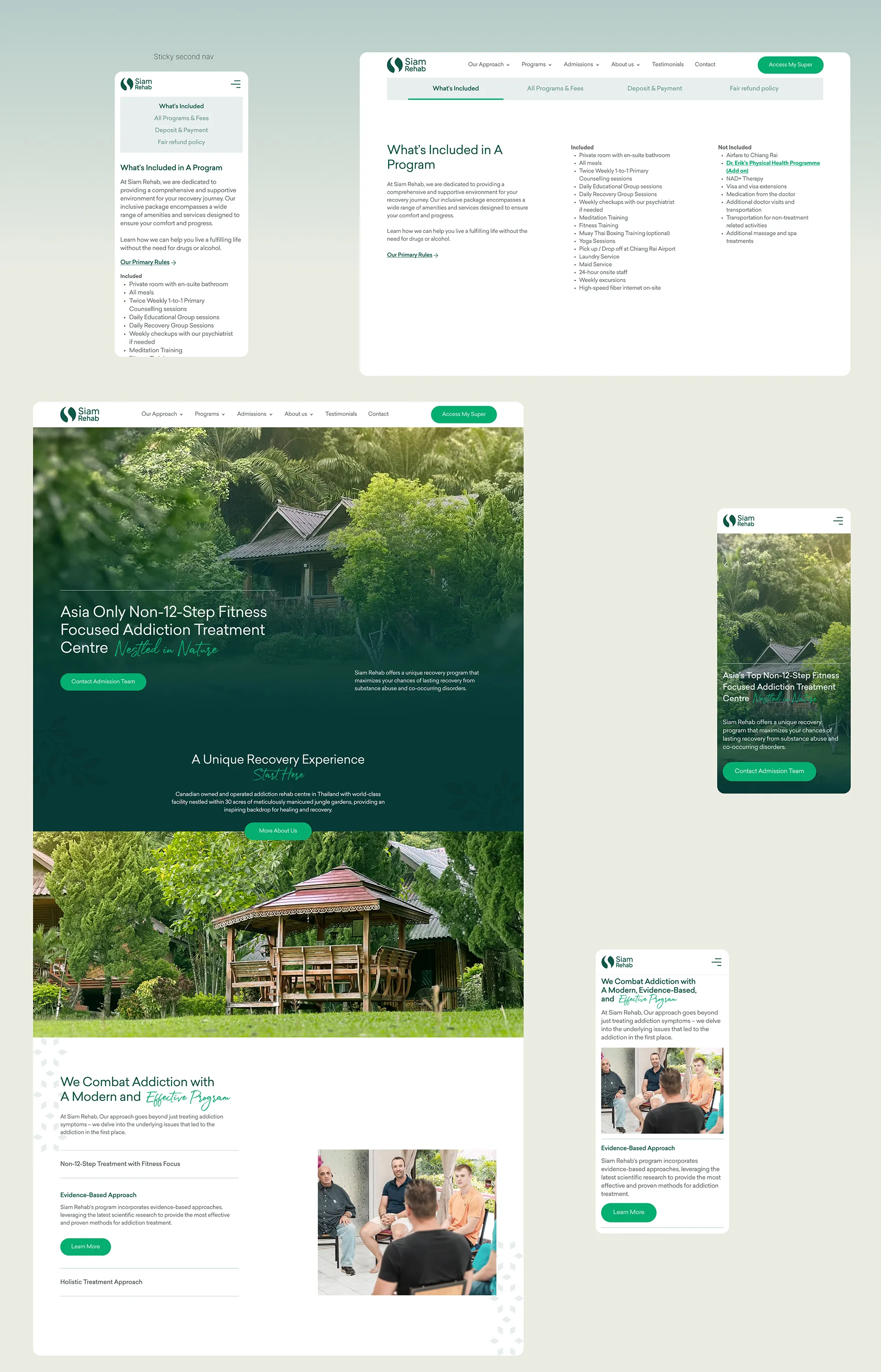
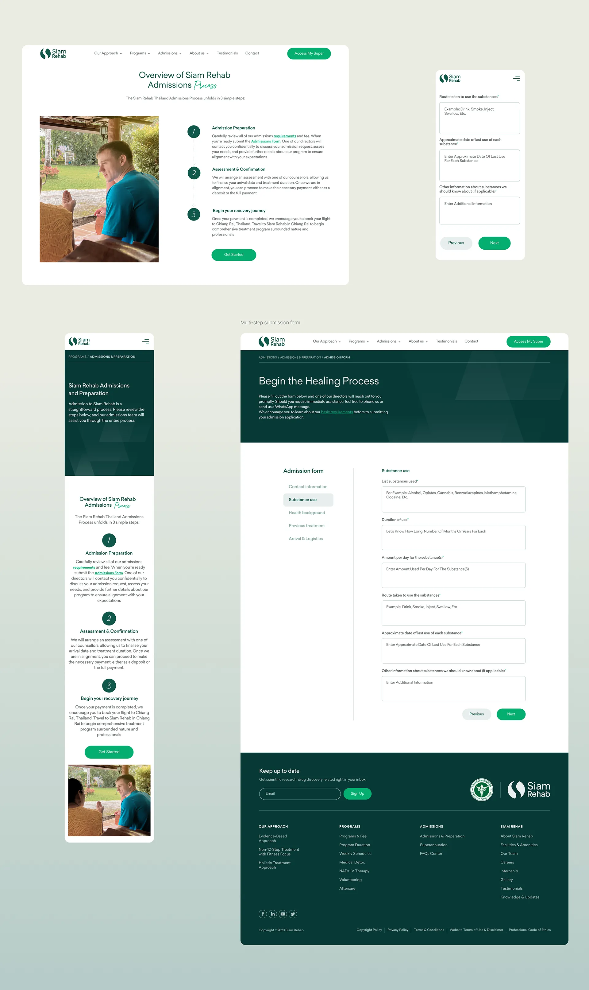
I mapped all 26+ pages against a prospective client's core needs: programme details, duration, pricing, and application steps. Almost none of this was surfaced clearly due to unstructured page duplication. The admission form required a complete overhaul—replacing a daunting single-page form with a progressive, multi-step flow to distinguish casual enquiries from serious applicants.

Siam Rehab Interface Mapping Audit
Interface programmatic audit breakdown mapping structural site flaws.

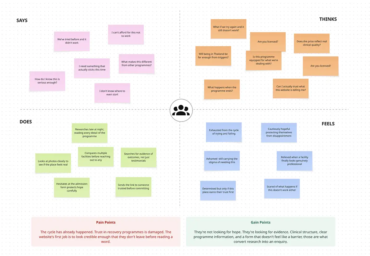
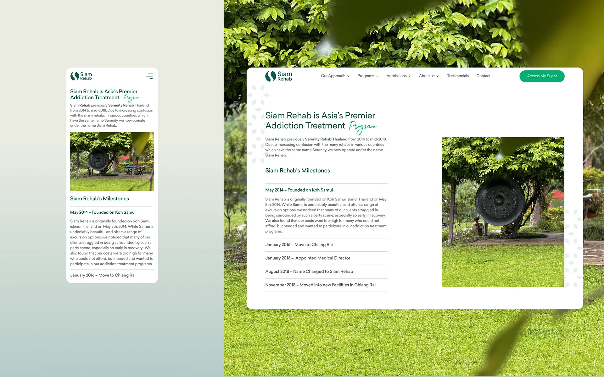
Admissions data revealed a single shared experience for both clients and their families: trust in recovery was already damaged, and the website's first job was to establish immediate credibility. Instead of assumptions, we built the architecture around their most urgent questions: licensing, daily routines, and voluntary leave policies. Since Siam Rehab accepts only 10–15 clients per cohort, the goal was never volume, but ensuring the right people reached the admission form fully informed.

Siam Rehab User Empathy Map Canvas
INFORMATION ARCHITECTURE

Site Structure and Admission Flow

The redesign introduced a clear hierarchy: each programme received a dedicated template detailing duration, pricing, and inclusions. We replaced the overwhelming single-page admission form with a multi-step flow (enquiry, programme interest, personal situation, contact details) to reduce cognitive load and effectively screen for applicant intent.

Siam Rehab Revamped Architecture Diagrams
Revised navigation logic and flows mapping.
VISUAL DESIGN

Photography Direction

Existing photography made a professional facility look amateur. I travelled to Thailand and produced 700+ images on-site. The brief was strict: professional, not luxury. We needed clean environments and genuine interactions—nothing staged that would misrepresent the facility's identity as a serious recovery programme.

Siam Rehab Directing Strategy Frame
FINAL SCREENS

Responsive Interfaces & Framework Deployment

Screens showing the homepage, programme overview, individual programme pages with consistent template structure, photography integrated across the site, and the multi-step admission form across its stages.

Full Responsive Navigation Shell View
Framework Breakdown Item 1
Framework Breakdown Item 2
Interactive Data Component Grid Screen

Design Decisions

A multi-step form reduces cognitive load for users making high-stakes decisions and builds commitment progressively, providing the admissions team with a cleaner signal of intent.

Siam Rehab's value lies in its actual environment and staff. Generic stock imagery wouldn't build trust. I shot 700+ on-site photos to authentically communicate a professional, serious recovery environment without false luxury.

The old site's technical debt made templating impossible. Rebuilding in Bricks Builder allowed for a proper component-level design system while carefully preserving years of accumulated SEO ranking.

DESIGN SYSTEM

Scalable Component Library

A full design system was built in Figma covering the complete 26+ page site, with component states for all interactive elements and a consistent type and spacing system applied across all page templates. The system was built for handoff: every component named, every asset optimised, every file organised for the development team to implement without ambiguity. The SEO file structure was prepared as part of the design handoff rather than left to be resolved during the build phase.

Design Token Architecture Guide Sheet
DEVELOPMENT

SEO Preservation & Paced Deployment

Developed in Bricks Builder by my partner Matthew Nunn, the build was paced over three months. This careful migration ensured we preserved the site's extensive SEO structure, URL hierarchy, and page authority.

Project Outcome
+108%
Increase in monthly admission form submissions post-launch
16.6
Average admission forms per month (vs 8 pre-launch)
A
GTmetrix with 99% performance, 100% structure optimization metrics

At programme fees ranging up to €24,500 per client, the admission form is not just a form. It is the primary revenue mechanism of the business. Enquiries now come from 40+ countries. Direct feedback from Siam Rehab's clients confirmed the redesigned application was easier to navigate and less confusing than the previous site.